A11y Tool · 2020 · Sketch Plugin
Developing Inclusive Design Habits for the Average Sketch User
Abstract
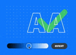
Cluse is a Sketch plugin that serves as a diagnostic tool to ensure that the design meets WCAG 2.0 color contrast standards. To address the lack of an accessibility workflow on design teams, I set out to create a tool that is free, open-source, lightweight and baked into the tools designers use most.

Developing Inclusive Design Habits for the Average Sketch User
UNDERSTAND
DEFINE
DESIGN
DEVELOP
VALIDATE
PROMOTE
EXHIBIT
What is WCAG?
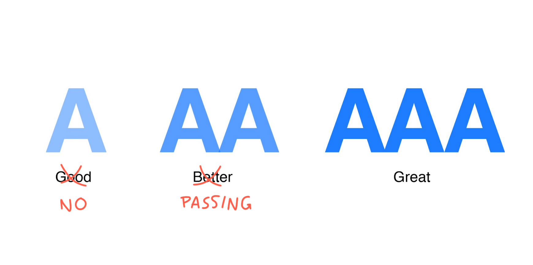
Web Content Accessibility Guidelines, or WCAG, are a reference for developers and designers to make websites more accessible to people with disabilities. The guidelines outline accessibility best practices, such as alt-text in HTML and recommended line-spacing. WCAG evaluates accessibility via three conformance levels, from least to most accessible: A, AA, AAA.
You’ve Been Served
Since 2017, U.S. Access Board established WCAG as the standard for web accessibility for US businesses. Legal frameworks require websites to meet at least AA WCAG compliance. Many corporations have failed to bring their sites up to standard and have consequently been sued. Below is a list of notable web accessibility lawsuits in the past decade. In every case listed, the defendant paid out large settlements that no doubt put a dent in their profits. For instance, Target settled for $6 million.
Notable Web Accessibility Lawsuits
- Netflix: National Association for the Deaf v. Netflix, 2012.
- Winn-Dixie: Gil v. Winn-Dixie, 2017.
- Five Guys: Markett v. Five Guys Enterprises, 2017
- Nike: Mendizabal v. Nike, 2017.
- Domino’s Pizza: Robles v Domino's Pizza, ongoing
- Target: National Federation of the Blind v. Target Corporation, 2006.
- FedEx: National Association of the Deaf v. FedEx, 2014
- Beyonce: Conner v. Parkwood Entertainment, 2019
- Blick Art: Andrews v. Blick Art Materials, LLC, 2017

Corporate View on Accessibility
After several legal precedents, designers began to pay more attention to web accessibility. During my time with Yext, I had my share of designing websites for commercial enterprises. As an SEO contractor that used client branding for custom web pages, Yext was wary of getting sued for accessibility issues on their client's behalf. Every team was briefed on the importance of WCAG, especially on websites that are used daily by millions of users. Generally, designers unquestioningly followed brand guides. However, when the client’s brand failed to meet WCAG, we notified them of their failings and proposed changes. This happened often. The frequency of WCAG noncompliance signaled to me that accessibility is still not something enterprises keep in mind. But why?
An Issue of Unresolved Responsibility
I have a conjecture regarding the lack of importance placed on accessibility in most teams: it is an issue of unresolved responsibility. Simply put: teams are not sure who is responsible for accessibility. Is it the copywriters who compose descriptive text? Is it the developers who put in place aria-labels and alt-tags? Although both roles are pivotal, the foundation of accessibility does not lie in writing or code.
So where does web accessibility start?
The barrier to full accessibility is erected before the developer even fires up his IDE. It is solidified before the copywriter rests his fingers on the keyboard. The key to the pearly gates of accessibility is visual design. Visual designers are the first line of defense against poor contrast, insufficient differentiation between hover states and non-descriptive link text. The path to accessibility begins in the designer’s Sketch file.
Design Challenge
How might we develop inclusive design habits for the average Sketch user by optimizing their workflow?
Defining the Project's Scope
Designers' Biggest Blunder
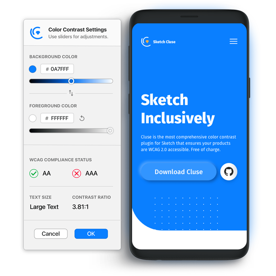
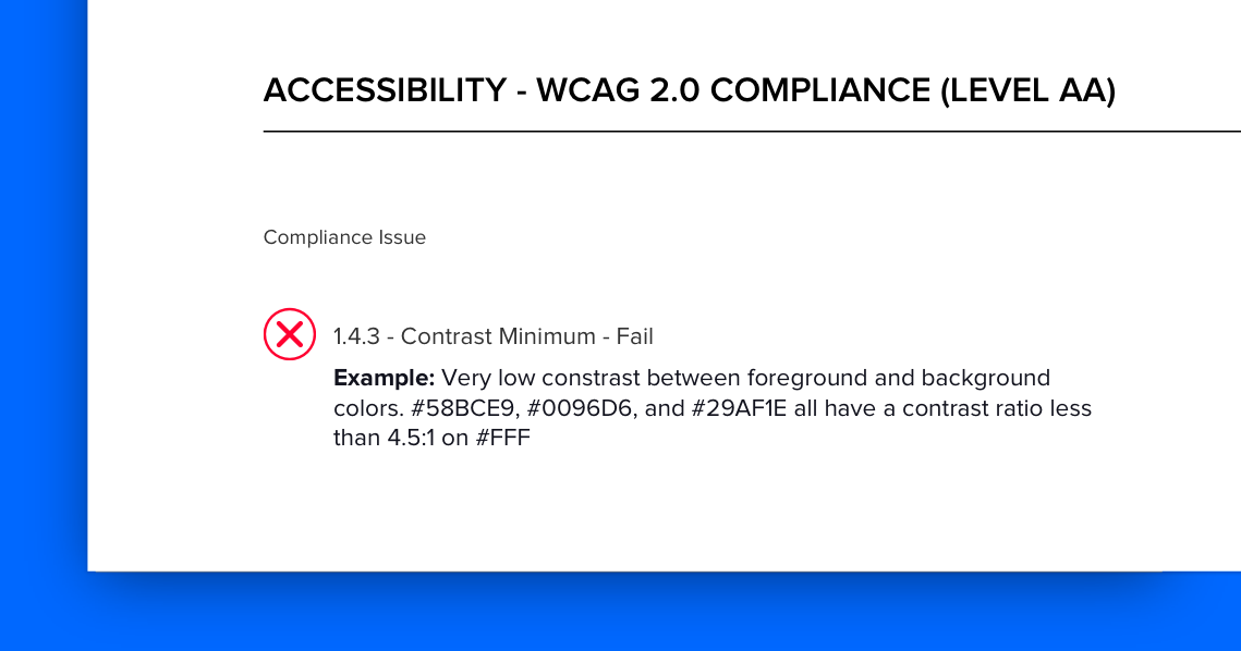
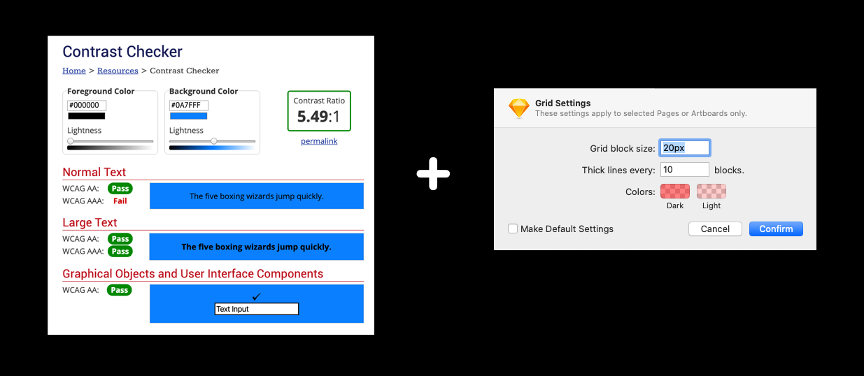
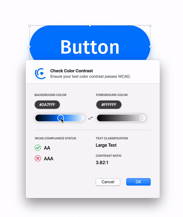
WCAG has a number of criteria geared towards designers. The criterium most designers are familiar with is color contrast. Because of this familiarity, it is the easiest one to incorporate into your workflow. WCAG use a ratio to determine the sufficiency of color contrast between two elements. For instance, white-on-white would have a ratio of 1:1, whereas black-on-white results in 21:1. The minimum ratio to pass WCAG is 4.5:1. Exceptions apply to what is defined as Large and Bold text. See Figure 4 for a demo.
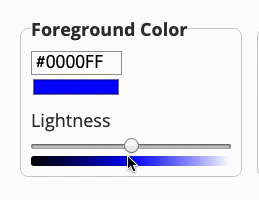
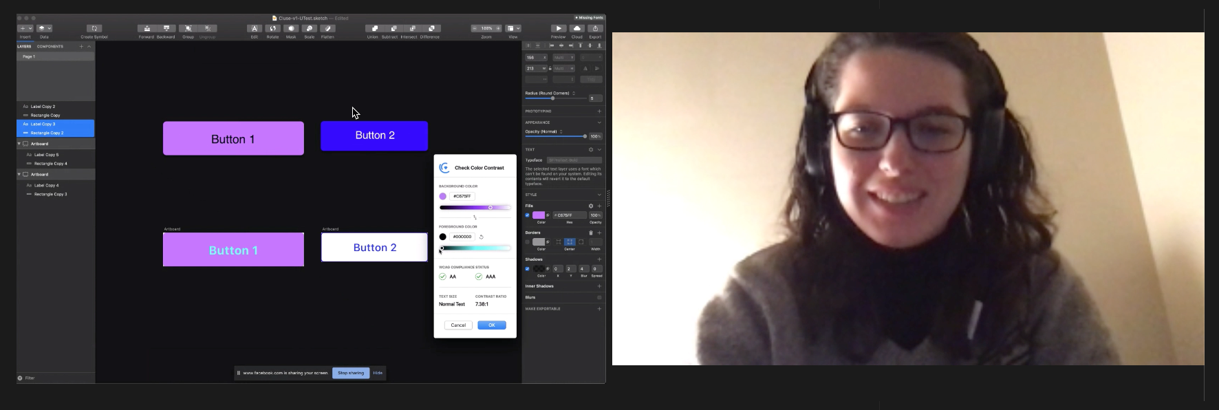
A Few Hex Values Away
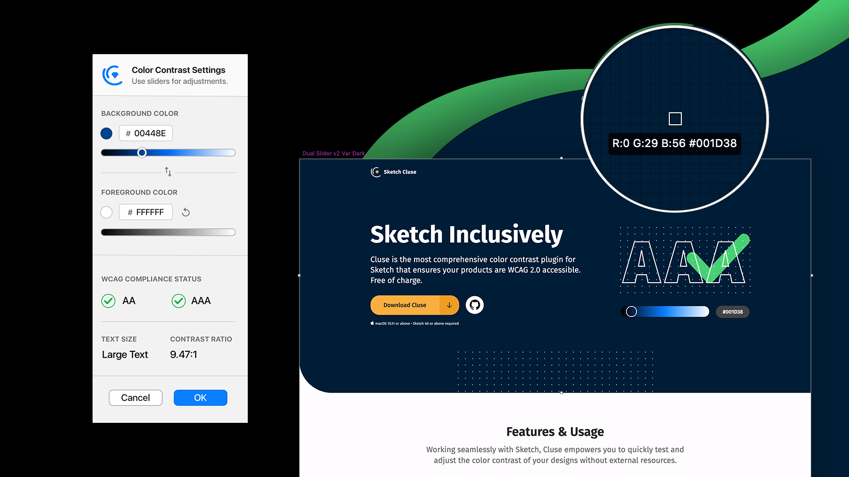
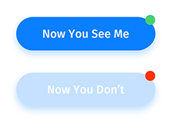
It is worthy to mention a curious aside about the nature of color contrast ratings. The difference between passing and not passing WCAG can be a few hex values away. To us, the passing color looks virtually the same as the failing color. To Target, the passing color would save them $6 million. This is demonstrated in Figure 5. The two shades look identical to us, but not to a lawyer.
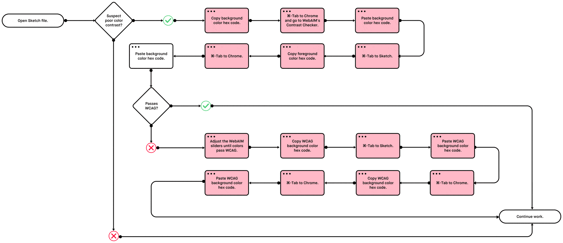
Contrast Checks and Workflow
During my time on Yext’s consulting team, I’ve observed a well-defined accessibility workflow. All branded assets were rigorously tested for passing color contrast. The team used WebAIM’s online Contrast Checker. I've interviewed visual designers from other companies. I learned that the WebAIM Contrast Checker is the most common used tool in the industry. It is used by many notable designers, including Studio Rodrigo, the team behind Adobe Fonts. Although this method is the most common, it is the least efficient. Below is a workflow of how each contrast check took place:
Instead of spending up to ten minutes tabbing in-and-out of Chrome and pasting in dozens of HEX codes, one could optimize the process using a design accelerator, like a Sketch or Figma plugin. If we eliminate all the copy-pasting and tabbing back and forth, this is what the new workflow would look like:


Competitive Analysis
Thankfully, there are a handful of color contrast plugins. After lurking the Sketch Plugins library, I compiled full chart of accessibility-based Sketch Plugins I've tested, sorted by feature. There was a clear leader in the field. A lot of people made small half-hearted plugins that just display a little notification. They give you a binary answer; you either pass WCAG or not. Stark, the leading plugin, did the same thing. Except it was wrapped up in a clean modal instead of a default Sketch notification.
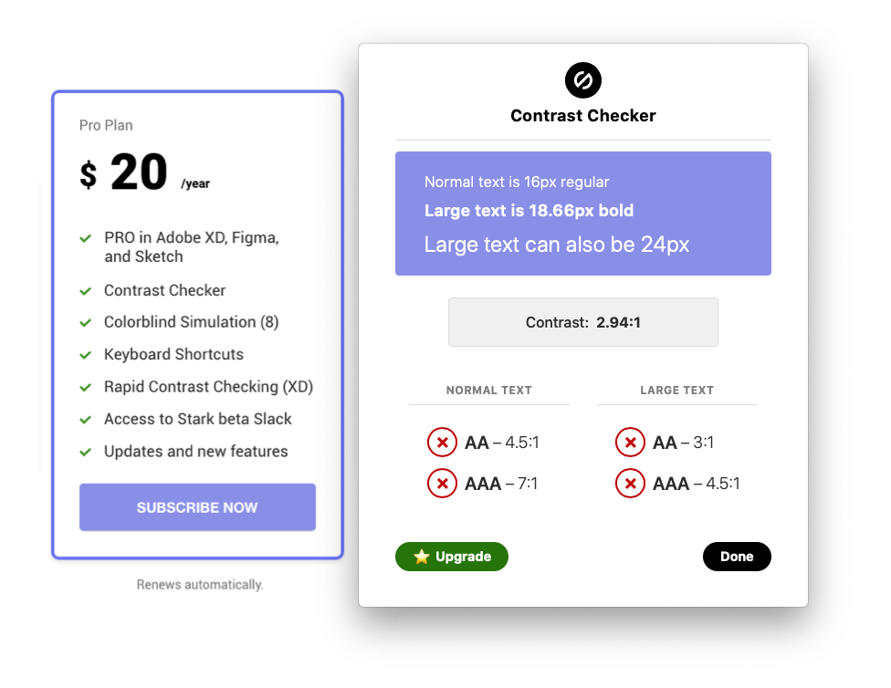
Stripping Stark Naked
Based on my competitive analysis, Stark is the best Sketch accessibility plugin the internet had to offer. I was most impressed with its clear display of pass/fail ratios and flexibility; in addition to checking text, you could check contrast between two shape layers. However, as a premium and proprietary software, it lacked accessibility. Passing WCAG values should be universal and free.
🔍 Insights
None of the plugins suggest substitutes for failing color combinations. This is a problem, because it still forces the designer to go back to WebAIM's Contrast Checker to procure passing hex values. The workflow remains a long copy-pasting journey. Additionally, no Sketch plugin exists for checking the differentiation in hover states and descriptive link text.

Slider's the Key
People don't use the current color contrast plugins because WebAIM's Constrast Checker is still a better option. Why? The slider's the key. The ability to fix failing WCAG values empowers designers in a way that current Sketch plugins don't. I set out to create a tool that allows users to not only detect poor contrast, but to change it without minimizing their Sketch workspace. After determining what I want to make, I established my deliverables for the project:
Deliverables
- Downloadable .sketchplugin File The plugin itself.
- Informational Website All good plugins ought to have one.
- Exhibition Plan This project will be shown at MICA's ArtWalk Exhibition
- Promotional Stickers Small and fun way to promote the plugin.
- Documentation on Github Necessary for all open-source projects.
Designing a Sketch-Esque Interface
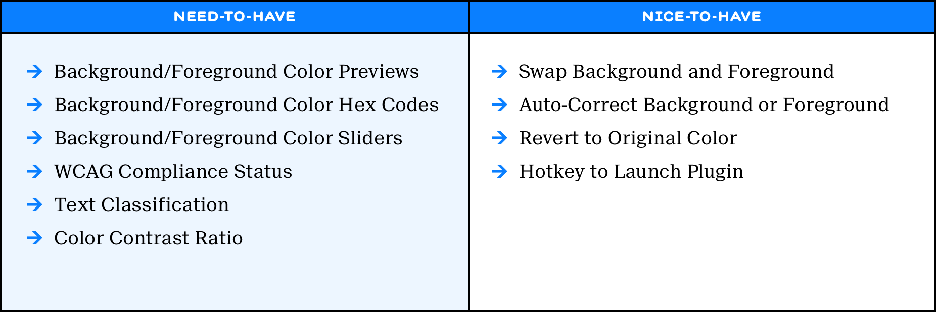
Feature Downselection
With 3 months to complete the project, I wanted to add everything that makes WebAIM's Contrast Checker great, and more. Although I minimized the number of features for the plugin to the essentials, I compiled a backlog of nice-to-have additions for the future.
Familiar Patterns
Good plugins look like an extension of the software. They do not visually overpower the tool they supplement. I think back to Stark's huge modal that covered 25% of my 13" MacBook screen. As my visual guide, I once again look towards the accessibility tool designers use most: WebAIM's Contrast Checker. I aimed to design a syncretic tool that functions like the Contrast Checker and fits into the Sketch visual language.
Iteratively Designing the Modal
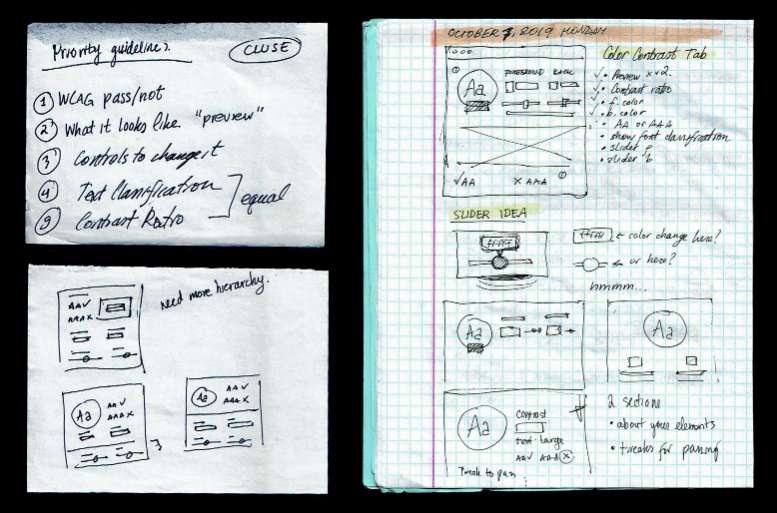
The most inobtrusive and realistic way to adapt a new external feature is to use the same technique as the software uses internally. In this case, Sketch displays auxilliary features as modals. After brainstorming wireframes based on my priority guidelines, I took to the artboard:
Cluse UI 1.0 User Feedback
- Why is the preview so prominent?
- Why is there no Cluse branding?
- What does the half-color mean?
- What's in the other tabs?
More Mac OS than Sketch
The code for Sketch's UI consists of many native macOS frameworks. I followed Sketch's example and created a macOS-style modal for a start. With high hopes, I tabulated the feature groups for future development. I borrowed the half-colored scrubber from Adobe, so that one could keep track of the original color. The crown on the initial design is a large preview that takes up a quarter of the modal. Upon speaking with users, as well as my degree project advisor, issues were noted. The premature tabulation ensures scope creep. The preview is not representative of most elements that are tested for color contrast. The modal lacked Cluse identifiers. The half-color scrubber was an unfamiliar pattern to most users tested and was too small to click on.
Cluse UI 1.5 User Feedback
- Three buttons for a simple modal?
- What's the point of two previews?
- Why are the hex inputs dark mode?
- Tautological section labels.
More Sketch than Mac OS
Cluse's next iteration was more Sketch than macOS. Instead of the dark-mode hex inputs, it mimicked the Sketch inputs. The Sketch-modal-style header was now adornished with Cluse's logo and some instructions. It also sported two previews, one for large text, and another for small text. However, the copywriting of the labels was unclear; the interface suffered from feature bloat and poor whitespace management. The next version aimed to trim down the fat.
Cluse UI 1.7 User Feedback
- Resembles Sketch a lot.
- Why not live preview instead?
- The sliders are comically thin.
Downsizing
After removing the superfluous preview, I concluded that this was the safest stage to start the code. Most of my time was spent on connecting the Sketch API and my WebUI, a methodology to create plugin interfaces for Sketch Plugins using HTML/CSS. While reading the Sketch API documentation, I learned that I could do a live preview instead of an in-modal preview of the color contrast. As a result, the next interface change is a significant pivot in the priority guidelines.
Cluse UI 1.9 User Feedback
- Cleaner colors.
- Sliders are too thick.
- Opportunity for compact layout.
- Repetitive instructions.
Live Preview
The live preview was a game changer. From this point on, when you moved the sliders, it affected the selected layers directly. With the blue box of placeholder text rendered obsolete, the UI was down to the essentials. I confidently proceeded with this design until the later stages of development.
Cluse UI 2.0 User Feedback
- Compact, allows for extra features.
- Resembles Sketch's sidebar.
- Sketch-style inputs and sliders.
- Logistics at the bottom.
- Action items on top.
Vertically Endowed Modal
The final modal for the 1.0 release of Cluse adapted the verticality of Sketch's sidebar menu. This allowed for an easy addition of new features, such as undoing or swapping colors. This layout is unlikely to change in the future, since it meets all requirements of the project's scope. Boiled down to the essentials, it allows one to select a two layers and check or alter their color contrast.
Quirks of Sketch Plugin Development
Learning Curve
Having no experience with making Sketch Plugins of this size, I took to Googling some tutorials. Surprisingly, there are very few resources on this sort of thing, especially when you're trying to make your own user interface. Matt Curtis' tutorial in Smashing Magazine is the most helpful guide I've found. I took meticulous notes on Sketch API, Objective-C and MochaJS concepts and seeked outside help from Kian Bradley, a developer at AWS.
Bridging Sketch API and a Web UI
Although my interface is minimal, its implementation is not as simple as it looks. The actions of my plugin are more than Sketch API can accomplish singlehandedly. Sketch API needs to be supplemented by CocoaScript and MochaJS. CocoaScript is Sketch's proprietary language bridging Sketch API and internal macOS frameworks. MochaJS is used to bridge internal macOS frameworks and JavaScript. This allows me to create the UI with HTML and CSS and write all the logic in JavaScript.
Deprecated Role Model
Like the design, my development journey took inspiration from WebAIM's Contrast Checker. Before I take on a role model, I try to find its vulnerabilities. After trying to break the Contrast Checker for a few minutes, I found a functionality-breaking bug. If one scrubs the slider either to the left-most or right-most side and returns it to the middle, all the color data disappears. The user remains with shades of gray. I downloaded the source files of the web page and looked at the algorithm used for calculating the contrast ratio, as well as changing the hex value. Based on the presence of a math( ) function, I concluded that we're dealing with some fine vintage code.
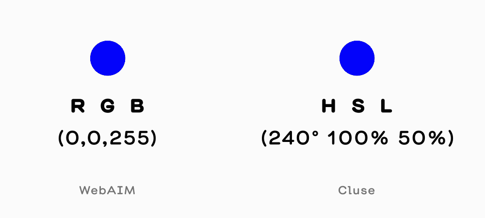
Eliminating WebAIM's Hue Data Loss
The loss of color data ocurred because WebAIM's code converted the hex user input into RGB for contrast ratio calculation. When you scrubbed the slider to the minimum brightness value, the RGB value was (0, 0, 0). This means that the original hue of the hex code is not retained. On the other hand, I used an HSL color model, which saves the hue. In HSL, the slider controlled by the user alters the luminosity value and preserves the hue, eliminating WebAIM's hue data loss. Then I filed a bug report to WebAIM.
Conducting Usability Testing
Task Analysis
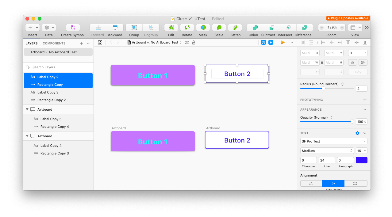
In order to test Cluse's ease of use, I planned a task analysis. I created a test file to disseminate throughout my user testing group. In addition to testing basic actions, I want to test one variation: whether users select an artboard or the layers for testing. All my users were proficient in Sketch, although only one of them has used any sort of plugin before.
Verbal Instructions
- Launch Cluse for Button 1
- Make Button 1 pass AA
- Undo the change.
- Make Button 1 pass AAA
- Save Button 1
- Launch Cluse for Button 2
- Swap the Colors on Button 2
- Save Button 2
- Now do the same actions to the next set of buttons.
What Users Said During a Cognitive Walkthrough
The following are some of the most insightful quotes I have gathered from the usability test:
- Nothing was confusing. It's a straightfoward kind of plugin.
- I will say that when you asked me to Undo the change, I reached for ⌘+Z. It didn't work. Then I saw the undo button.
- How does it distinguish text size?
- It's very compact, looks like the Sketch sidebar.
🔍 Insights
Most users followed the projected workflow. Two out of three users stumbled on the second part of the test with artboard-based buttons. Seeing that the button is an artboard, the users selected the artboard and tried to launch the plugin. However, when seeing that the plugin is not launching, they selected the background and foreground layers separately. This may be a learned behavior from the first test. This issue signals to me that I should create a functionality in Cluse to select artboards and layer groups as long as they have a background and a foreground. Another user's first instinct upon needing to Undo was to click ⌘+Z, but that shortcut does not exist in Cluse yet. That was such a no-brainer that I added it immediately after the test.
Promoting Web Accessibility
Online Presence
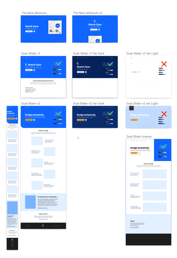
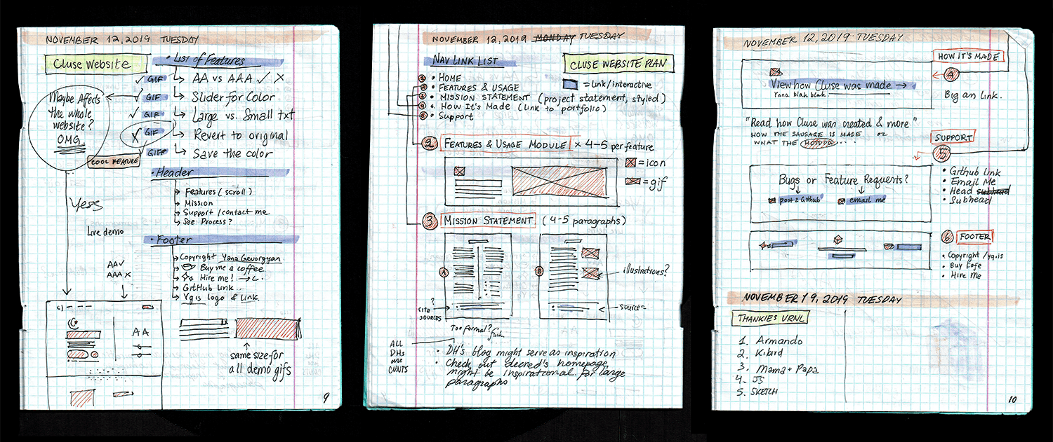
In addition to maintaining a readme on GitHub, a good way to establish an online presence for the plugin is to create a website for it. I used my accelerated process for building sites: priority guidelines, wireframes, then mid- to hi-fidelity mockups.
Breaking the Fourth Wall
Although most plugin websites were minimal, consisting of a few screenshots and a download link, I wanted to try something different. After some experimentation, I chose to highlight what separates this contrast plugin from the rest: a slider. My final iterations included an interactive slider on top of the site. Upon scrubbing back and forth, the entire background of the site changes and reveals whether the combination passes WCAG or not. This was also the most time-effective option, as I reused the very code Cluse uses to analyze color contrast. Feel free to mess with it on Cluse's site.
How does one exhibit software?
Beyond Screen-Centric Exhibitions
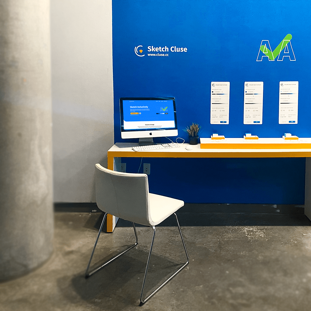
As Cluse is my degree capstone, it was to be exhibited in the senior show. This posed an interesting challenge. Cluse was a piece of software, unlike other exhibited projects rooted in graphic design. How do I exhibit software? I did not want to put a screen on a pedestal and call it a day, so I decided to think about the context in which Cluse would be used in. As a result, my exhibition aims to recreate a designer's workspace. I had a large desk, a chair and a plant to accompany the monitor. Additionally, I painted the gallery wall Cluse-blue and plotted vinyl decals on it to mimic the Cluse's homepage.
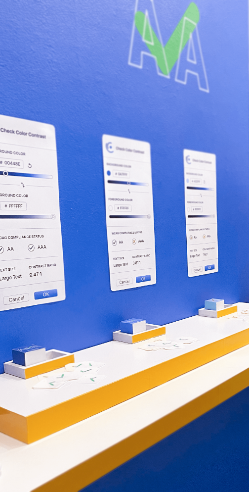
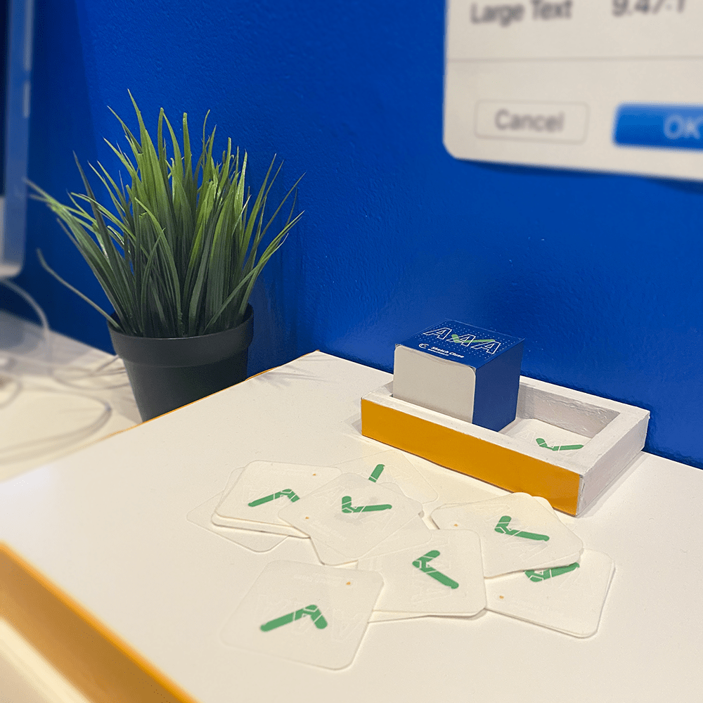
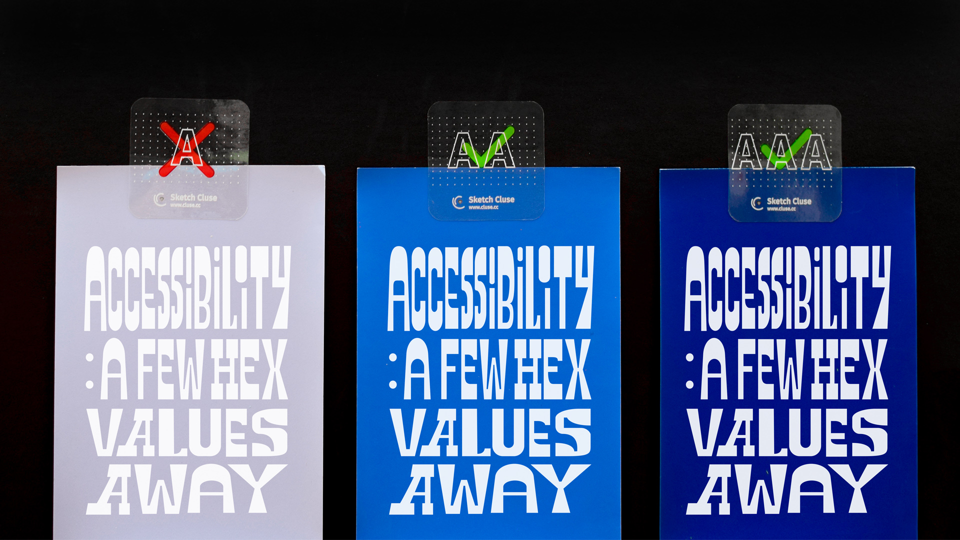
Guerilla Sticker Campaign
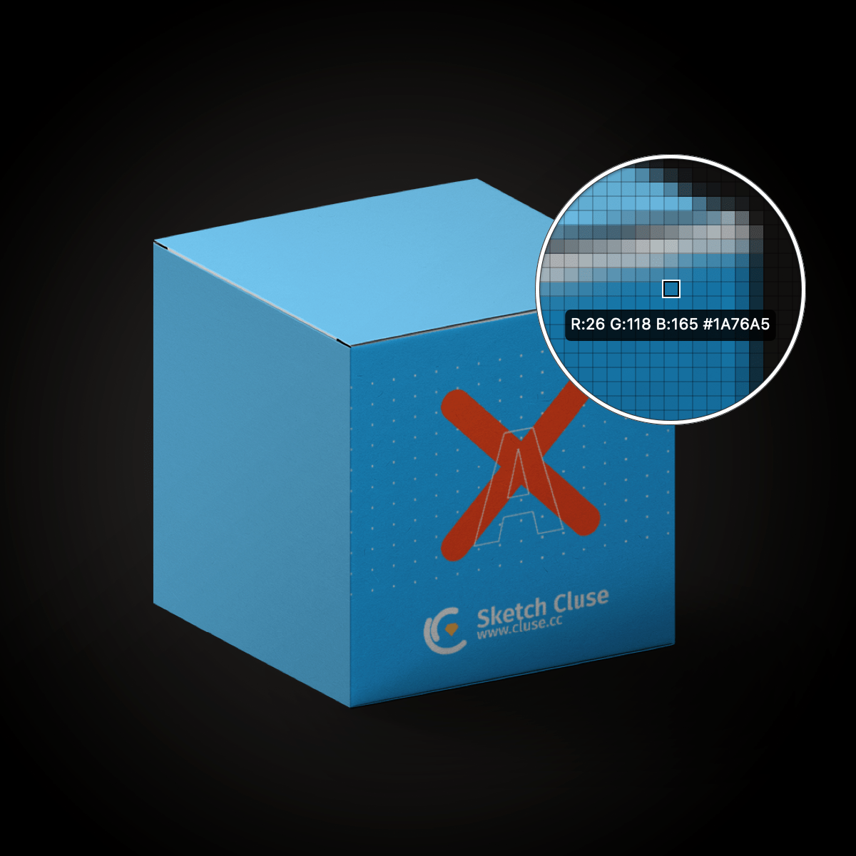
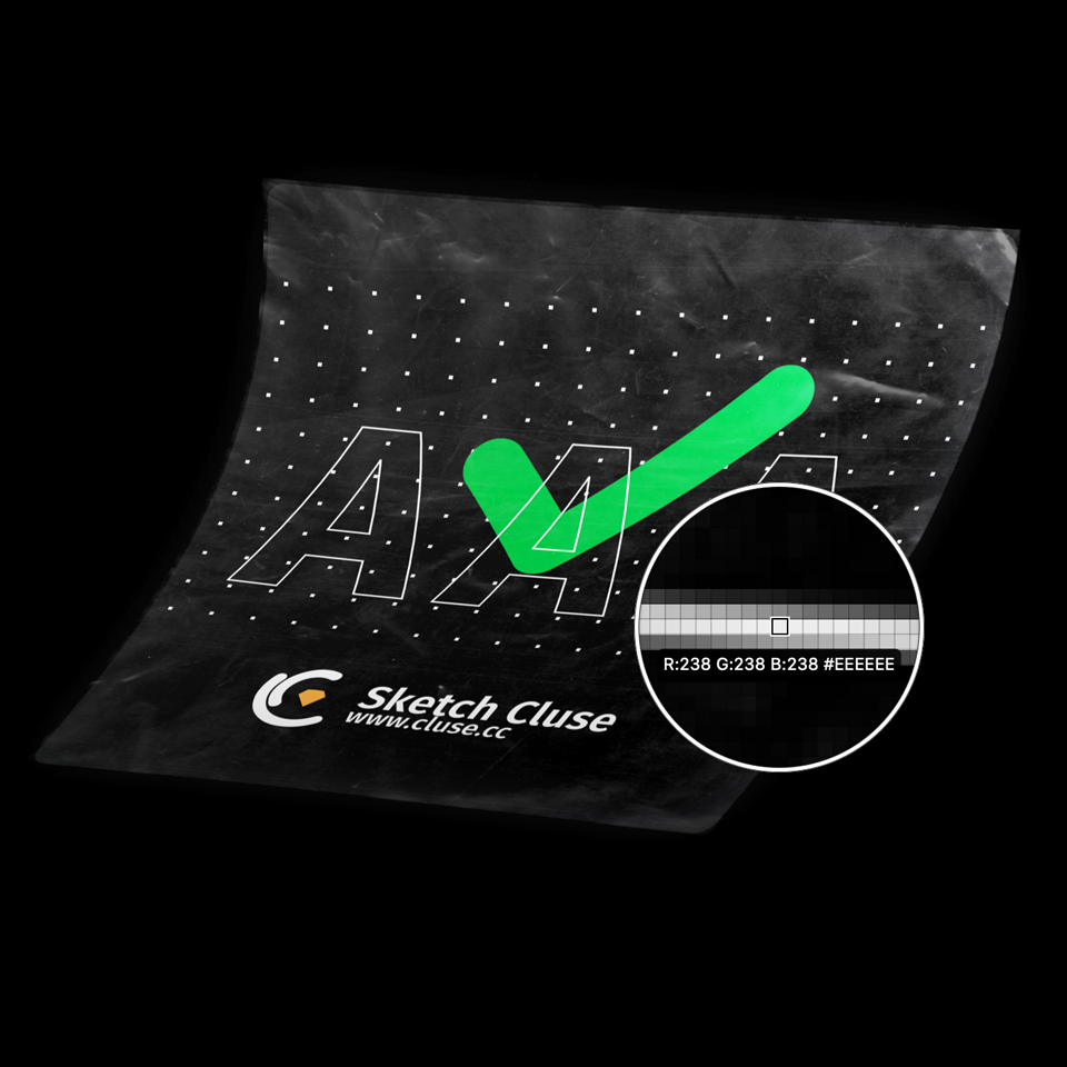
To expand on my exhibition, I designed transparent stickers with the three WCAG conformance levels and had them printed on transparent sticker paper with white ink. Each pile of stickers on the table was accompanied by a cube showcasing an example of that kind of color contrast, as well as a corresponding Cluse modal poster above it. The stickers were disseminated to people as a form of a guerilla campaign against poor color contrast. The audience were encouraged to place the stickers in places around campus. For instance, examples of exemplary color contrast, would get the AAA sticker, whereas poor color contrast would receive the A sticker.
Exhibition Feedback and Future Endeavors
Feedback from faculty and students has been overwhelmingly positive. The new chair of Graphic Design at MICA proposed that it should be part of the curriculum of a UX class taught in the fall. I have started working on a Figma port for the plugin, so that it can be used in the classroom, starting Fall 2020. Otherwise, I will work on bug fixes as they come in and maintain the project as long as I can. Check GitHub for the latest release.
Sketch Endorsement
Since February 2020, Cluse has been officially endorsed by Sketch in a Facebook post. In May 2020, for Global Awareness Accessibility Day, I gave an interview to Sketch about Cluse, as well as my views on accessibility in the design sector.