Font Tool · 2019 · Sketch Plugin
Optimizing a Unique Typographic Workflow for UI Designers at Yext
Abstract
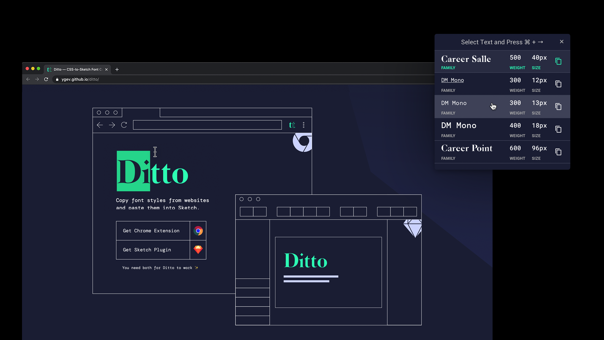
Ditto is a Chrome extension with a companion Sketch plugin that allows designers to copy CSS font styles from live websites and paste them directly into Sketch as Sketch styles. It was created to improve the workflow of the UI Design team at Yext.
UNDERSTAND
DEFINE
DECIDE
PROTOTYPE
VALIDATE
Designing Backwards
Normally, product prototyping tools like Sketch and Figma are used to create designs that will end up on the web, rather than copying what is on the web into the prototype. However, this is the use case at Yext, and I was tasked with creating a tool that performs this workflow more efficiently, using my skillsets in UX design and UI engineering.
Reverse-Engineering a Brand
The UI Design team at Yext creates custom landing pages for Fortune 500 clients, from Taco Bell to Marriott International Hotel. This means that when you search for “Taco Bell near Union Square,” the first result will lead to a custom landing page for Taco Bell Union Square, designed by Yext with information that is up to date and customized to that particular location. In order to design these subpages, the team needs to pull client’s styles from their site into Sketch to design additional pages. Since not all clients have custom Sketch libraries, style guides or even their own design team, the team at Yext has to compile these styles manually, using the client’s site as a source of truth.
Cobalt Atomic Design Language
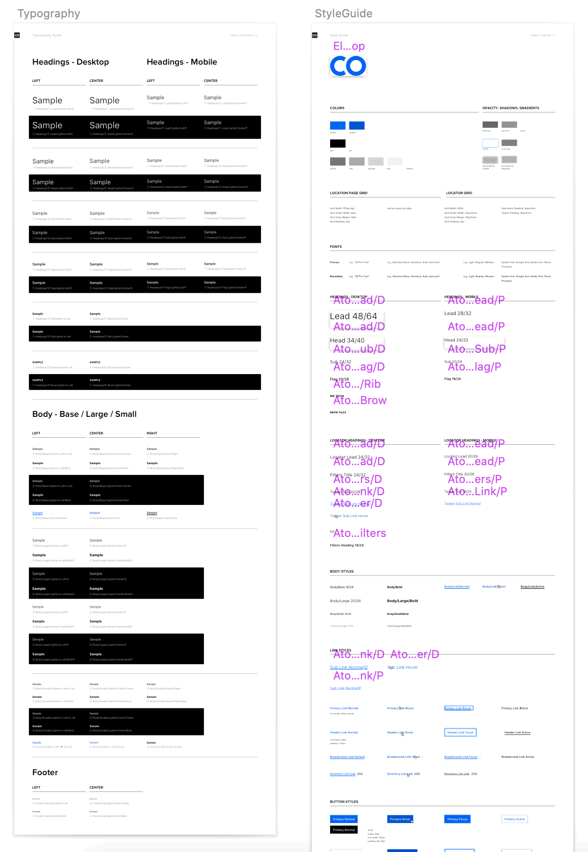
The system by which the team collects the client's style guide is called Cobalt. It is an atomic design system that contains components the team might need to construct a location page. This includes the grid of the original website, known information architecture patterns, and so on. At the beginning, the team compiles style guide for the main colors, fonts and other design patterns scavenged from the clients website. This is demonstrated in Figure 1.
Defining the Pain Points of the Team's Workflow
Copy-Pasting Galore
The impetus for this project is an opportunity to accelerate the team's workflow. Currently, UI designers at Yext take up to a minute per font-style. Their CSS-to-Sketch workflow consists of relying heavily on their own memory and Chrome Dev Tools to manually find every property of a font and copy it to Sketch, from font-family to letter-spacing. This gets very tedious, especially when you are working on several clients a day and copying up to a dozen fonts per client.
Desired Workflow Acceleration
I compiled a workflow graphic for me to analyse and highlighted areas that were most stressful to the team. Afterwards, I thought about aspects of it can be automated. Copying-pasting between Chrome and Sketch are the most tedious task for the designers and is the easiest to automate. Unfortunately, I cannot do anything about switching windows between the two programs, other than limit the number of times one will have to do it.
After generating an updated flowchart of the workflow adjustments, my problem was defined, and I conceived a How-Might-We statement to help direct my future brainstorming and prototyping vision.
Design Challenge
How might we optimize the unique CSS-to-Sketch workflow of UI designers at Yext?
Deciding on the Project's Scope

A Note on Design Accelerators
I never truly appreciated plugins and hotkeys before starting to work in an environment as fast paced as Yext. Design accelerators can cut down on a lot of time. For instance, hotkeys can reduce a task from clicking through a series of nested menus to one click. In fact, some designers on my team, including me, use gaming mice with programmable hotkeys, such as the Razer Naga Trinity. Therefore, I kept in mind the team's love of hotkeys when designing this tool.
What medium is best for this design accelerator?
Since the workflow deals with Chrome and Sketch, it seems that it will either have to be a Chrome Extension or a Sketch Plugin. After doing some research on the functionalities of both, a software engineering intern and I decided that it will have to be a combination of the two. We outlined what actions the extension will do in Chrome and what the plugin will do in Sketch:
What properties define a font's identity?
In order to accurately copy the essence of a font, we needed to determine what makes a font style in CSS. These properties must also have equivalents in Sketch. For instance, the font-family property of CSS should correspond to the Typefaces field in Sketch. The final list of properties that are most commonly specified in CSS and make a font instantly recognizable as a distinct style are as follows:
- font-size
- color
- line-height
- font-weight
- text-decoration
- font-family
- font-style
- letter-spacing
- text-transform
- font-variant
- text-shadow
Conceiving the Initial Release
Downselection of Font-Properties for Display
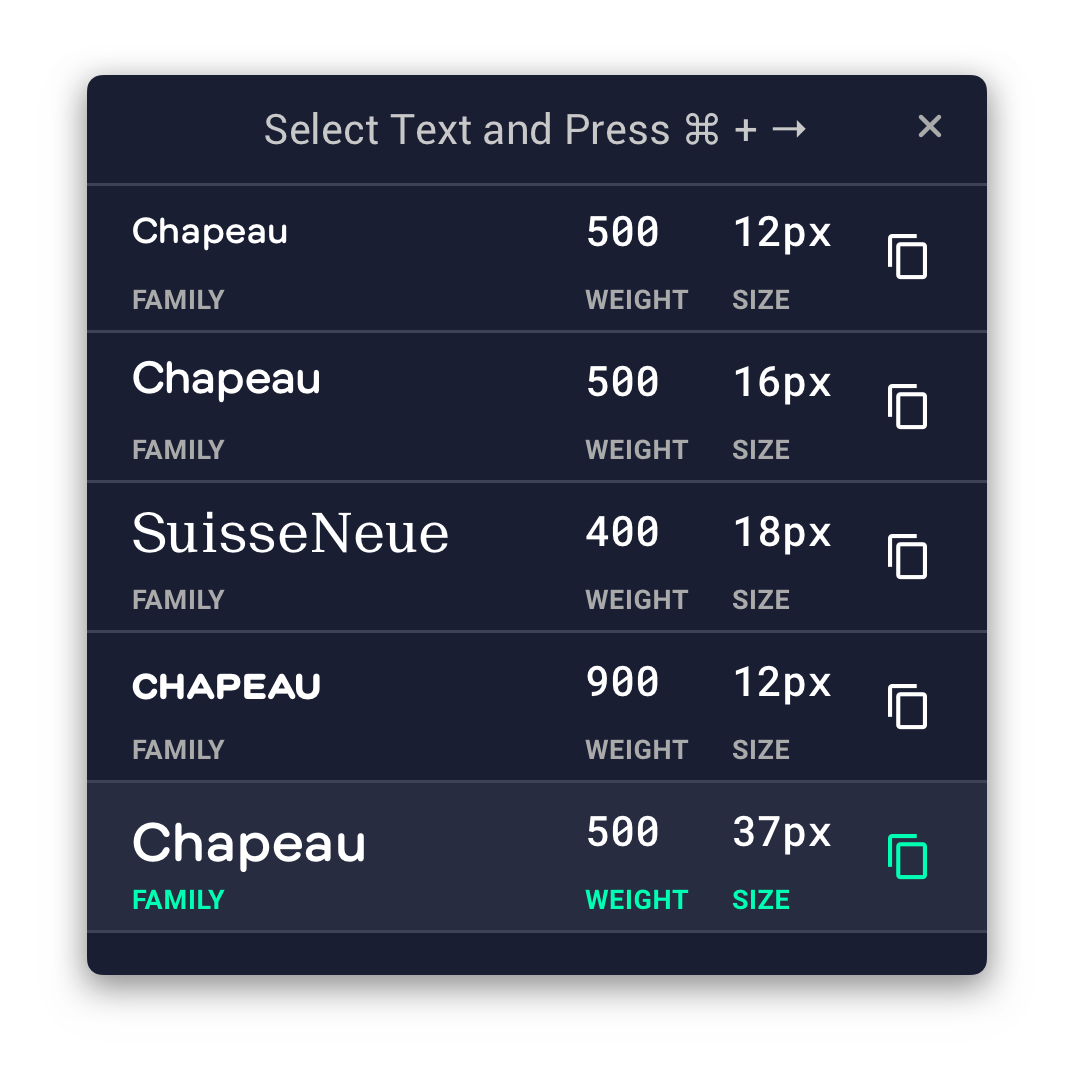
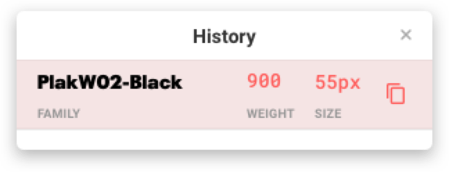
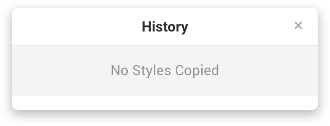
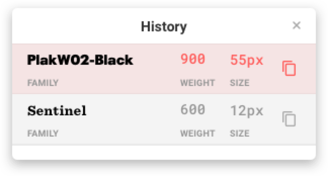
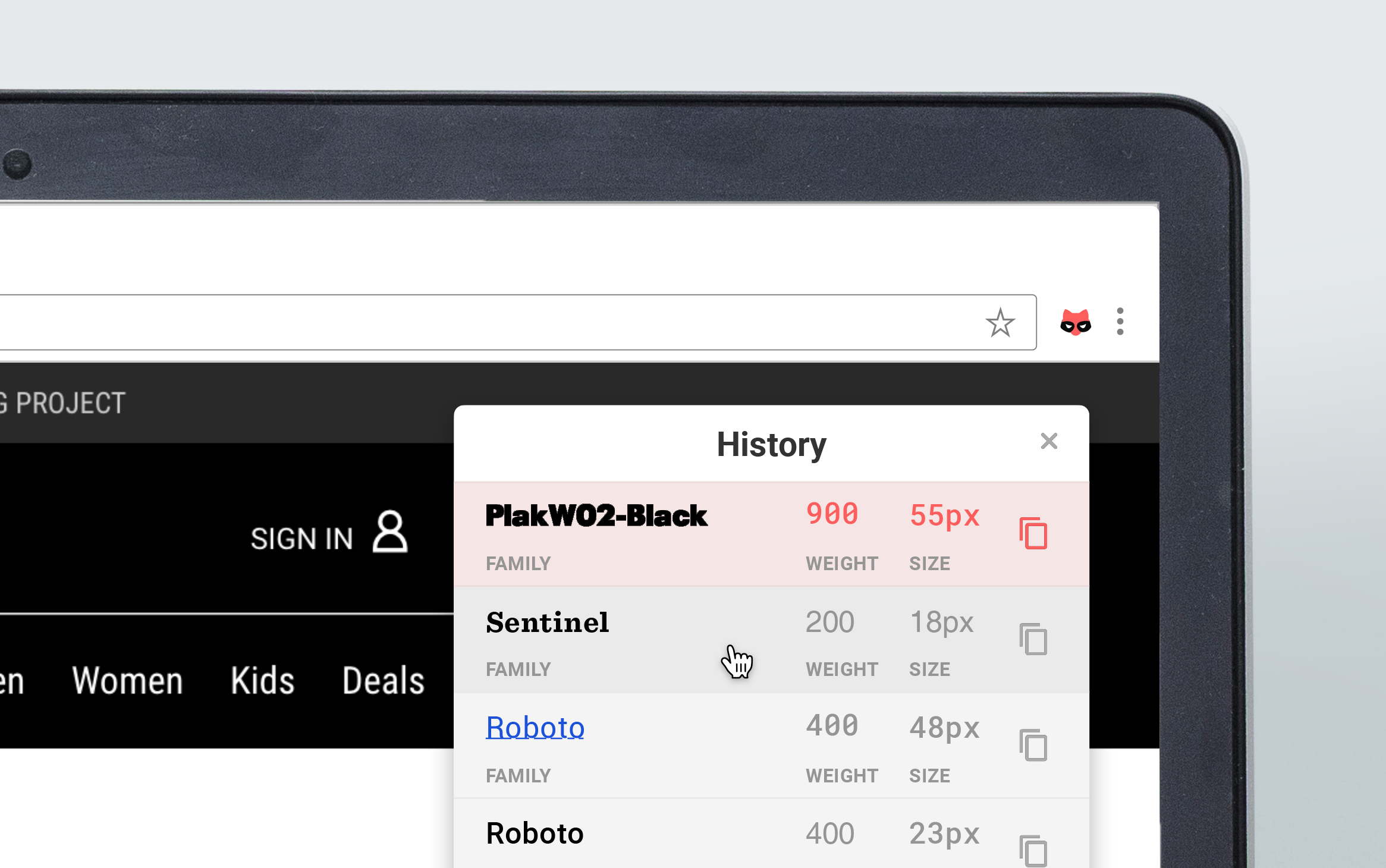
The primary interface of the Chrome extension is the modal with the Clipboard History that appears once the extension is activated. I identified font-family, font-weight and font-size as the three most important features of a font that will be displayed on the pop-up Clipboard History. The font properties that are currently in the clipboard will be highlighted in pink following the Google Material Design Guidelines and accompanied with a Material Icon of a copy symbol.
Developing the Chrome Extension and Sketch Plugin
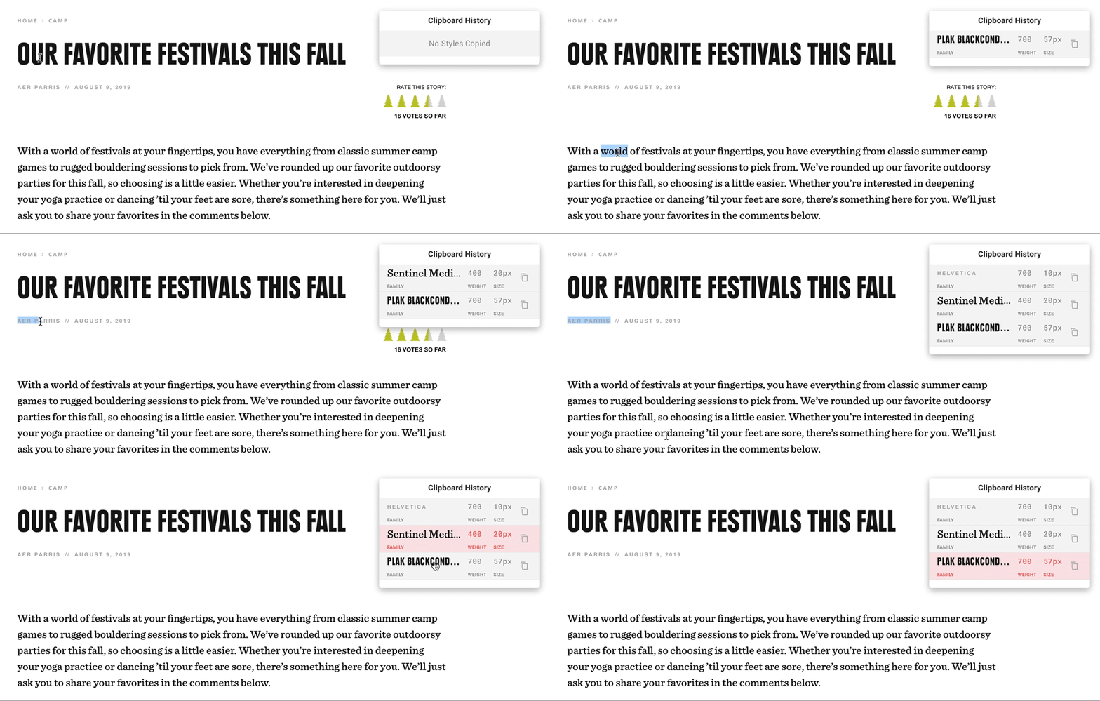
After the interface was complete, I had a hand-off with Blake Quigley. Within a week, he developed the initial code base for both the Chrome Extension and the Sketch Plugin, incorporating dropdown animations we discussed during the handoff. The plugin entered the QA section of the development process and we asked the UI Design team to use it for a week and note any bugs on GitHub.
Publishing to Chrome Store
After bug fixes and QA testing, the project was published to the Chrome Store under the moniker Klepto with an icon of a pink flamboyant raccoon. It was highly successful with the UI Design team and had 38 active users within a month of publishing, meaning that people outside of Yext tried it out.
Validation and Post-Internship Maintenance
A Paragon of Iterative Design
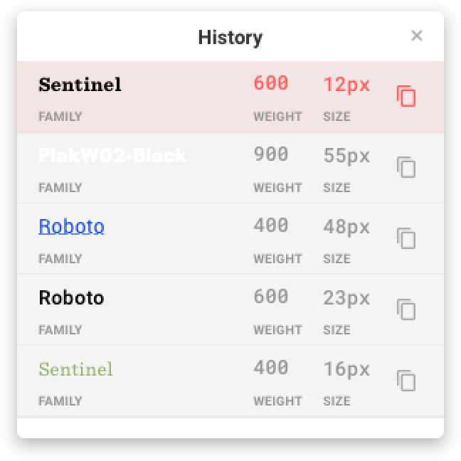
After graduating from the internship, I gained more skills in both web development, plugin creation, as well as visual design. I noticed that no one was maintaining this extension and took initiative to redesign it to make it more usable. I forked the repository and fixed a number of bugs, as well as removed code that was not doing anything. After speaking with other designers, as well as observing the plugin myself, I identified the following visual design issues:
Poor Color Contrast
- Cannot see white font-families.
- Light colored fonts invisible

Poor Visibility of Modal
- Most websites are light-mode.
- Cannot find modal easily.

No Directions for Hotkey
- Don't know how to copy font.
- How to activate the extension?
Additionally, the project lacked good usage directions and was never officially published to Sketch's plugin repository, which limited its accessibliity outside of the UI Design team's reach.
Usability Overhaul
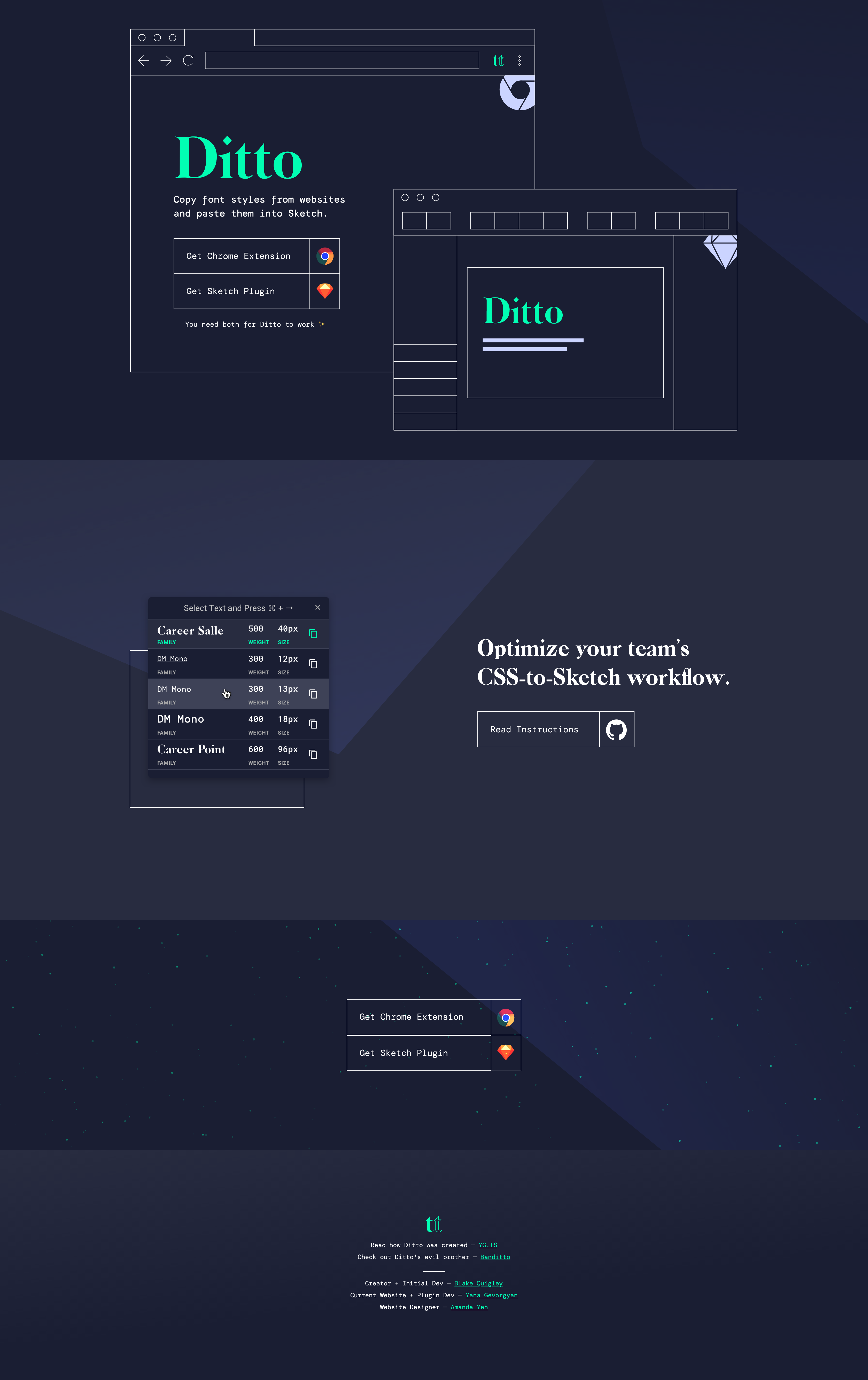
I took time to address each problem and came up with a solution for the Chrome Extension modal that solves every issue noted by the users and myself during the heuristic evaluation.

Features that Solved the Usability Issues
- Dark-Mode Interface The dark mode interface proved to be more visible for users on most websites and was better suited for the plugin. Perhaps in the future, I can use the new CSS option to detect the user's screen-mode and toggle dark-mode whenever appropriate.
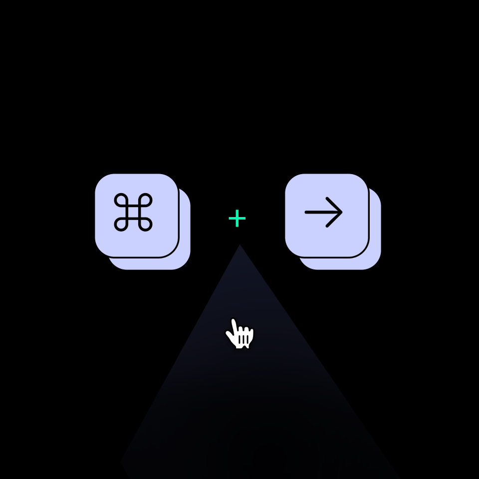
- Hotkey Directions in the Title I put the hotkey combination directly in the title of the modal, so that it was more clear what the next step was after activating the extension.
- Static Color for all Fonts Letting the color of all fonts display as white in the clipboard history allows all fonts to be perfectly visible. Selecting a black font will not obscure the font-family name due to poor color contrast. Moreover, this change makes for better accessibility, since that color combination is sure to pass WCAG AAA.

Creating a Monorepo
Additionally, I cleaned up the file structure on GitHub and made it clear for those who are trying to read the code, or even download the latest release without relying on Chrome's Web Store and Sketch's Plugin Repository.
Creating a Brand Identity and Website
I dubbed my updated plugin Ditto, a name that has a less negative connotation than Klepto, and a name that the UI Design team really enjoyed during our brainstorming sessions. I teamed up with my visual designer friend, Amanda Yeh, and developed a promotional website for the plugin that displays a new brand identity based on the dark-mode of the new Chrome extension.
Future Developments
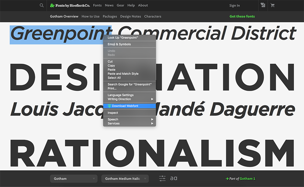
I hope to some day merge Ditto with another Chrome Extension I made: Banditto. Banditto fetches webfonts from websites and downloads them to your computer with a single click. As this can technically be used as a piracy tool, I feel uneasy going through with this, but the idea is still amusing to think about.
Subsequent Response from Yext
In late May of 2020, I have officially reached out to Tyler Anderson, the Senior UI Designer at Yext to see if I can take over the maintenance of the plugin, since no one has touched it since the end of my internship. He, as well as the Creative Director of the UI Team, Erin Pfiffner, were completely on board and commended my efforts to keep the plugin active. I am waiting on the final okay from Yext's legal team to push the updates to the Chrome Web Store!