Hacking · 2019 · Net Art
Raising Awareness About Cybersecurity with Gesamtkunstwerk
Abstract
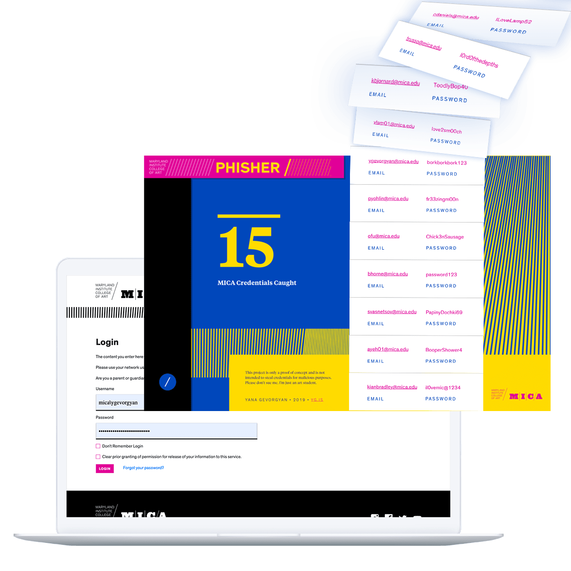
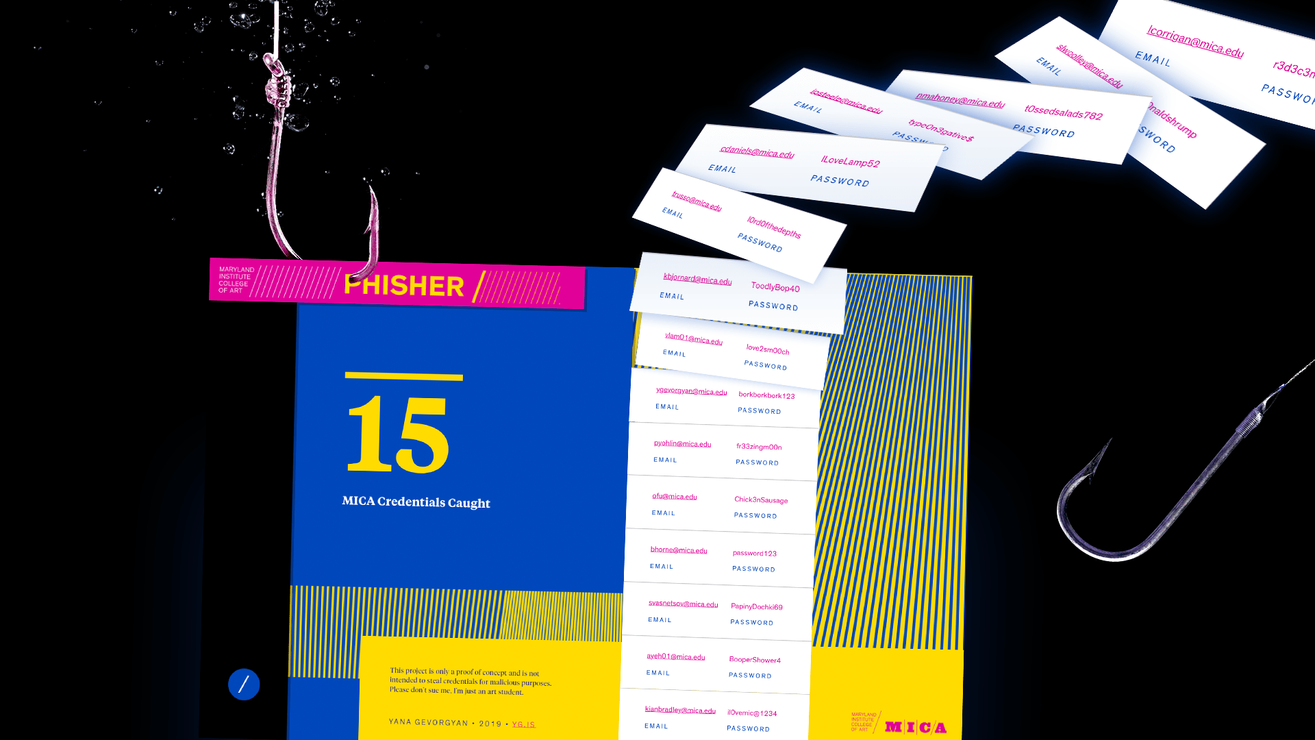
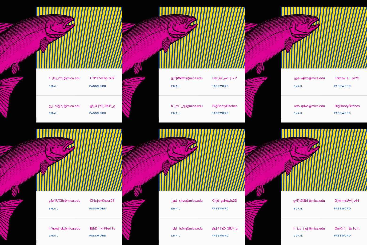
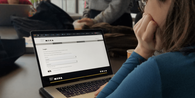
MICA Phisher is a proof-of-concept phishing site which spoofs Maryland Institute College of Art’s login page. It exposes the relative ease of creating tools to obtain sensitive information from unsuspecting users.
UNDERSTAND
DEFINE
BRAINSTORM
PROTOTYPE
VALIDATE
Research Questions
- How have attitudes towards OPSEC changed nation-wide, given recent data breaches and hacks?
- To what extent do people at Maryland Institute College of Art use password managers?
- To what extend do people mindlessly enter personal data into credible interfaces?
Surveying National Opsec Engagement
According to a study by the Pew Research Center, as of 2016, most Americans kept track of their online passwords by either memorizing them or writing them down. However, with subsequent data breaches, such as Capital One and Equifax, the popularity of password managers rose up. In 2019 a Threatpost poll found that 84% of respondents use password managers, with only 10 percent of people saying that they don't due to perceived security risks.
Surveying Students' Opsec Engagement
Even Maryland Institute College of Art's website implemented two-factor authentication for their students in 2019 with variable feedback from the students. I have informally surveyed 15 students and plotted the most insightful responses on a scale from positive to negative.
Considering Mindless UI Patterns
The main cause of phishing is the lack of user training. Especially in college, with weak Wi-Fi signal, students are used to mindlessly entering their password more than once without looking at the URL twice. This mindless data entry is an aspect of human behavior that can and is exploited.
Defining the Problem
After researching Americans’ attitudes towards password management, surveying students and reading about behavioral patterns, I concluded the following:
“
Never needed extra security, so it’s totally unnecessary to me.
”
Insights
- There is a rising awareness among Americans to use password managers, yet a small minority of people still get phished.
- Students at the Maryland Institute College of Art largely do not use password managers, nor do they see the importance of two factor authentication that has been established in 2019.
- Students mindlessly enter their passwords without double checking the URL first. Frequent bugs in MICA’s system force students to enter their credentials twice, which is an explotable feature.
Lack of Awareness
Based on these insights, I’ve concluded there is not enough awareness about how easy it is to steal one’s data on campus compared to the national average presented by the Pew Research Center. Phisher websites can be generated programmatically and it is far too easy to store passwords in a database with malicious intentions, even by an art student like me. Students largely didnt care much for the two-factor authentication employed by the school after a number of phishing attacks. There was clearly not enough awareness around the campus, leading me to pose the following design challenge:
Design Challenge
How might we raise on-campus awareness about phishing through an experiential medium while maintaining safety?
Brainstorming Awareness Campaigns
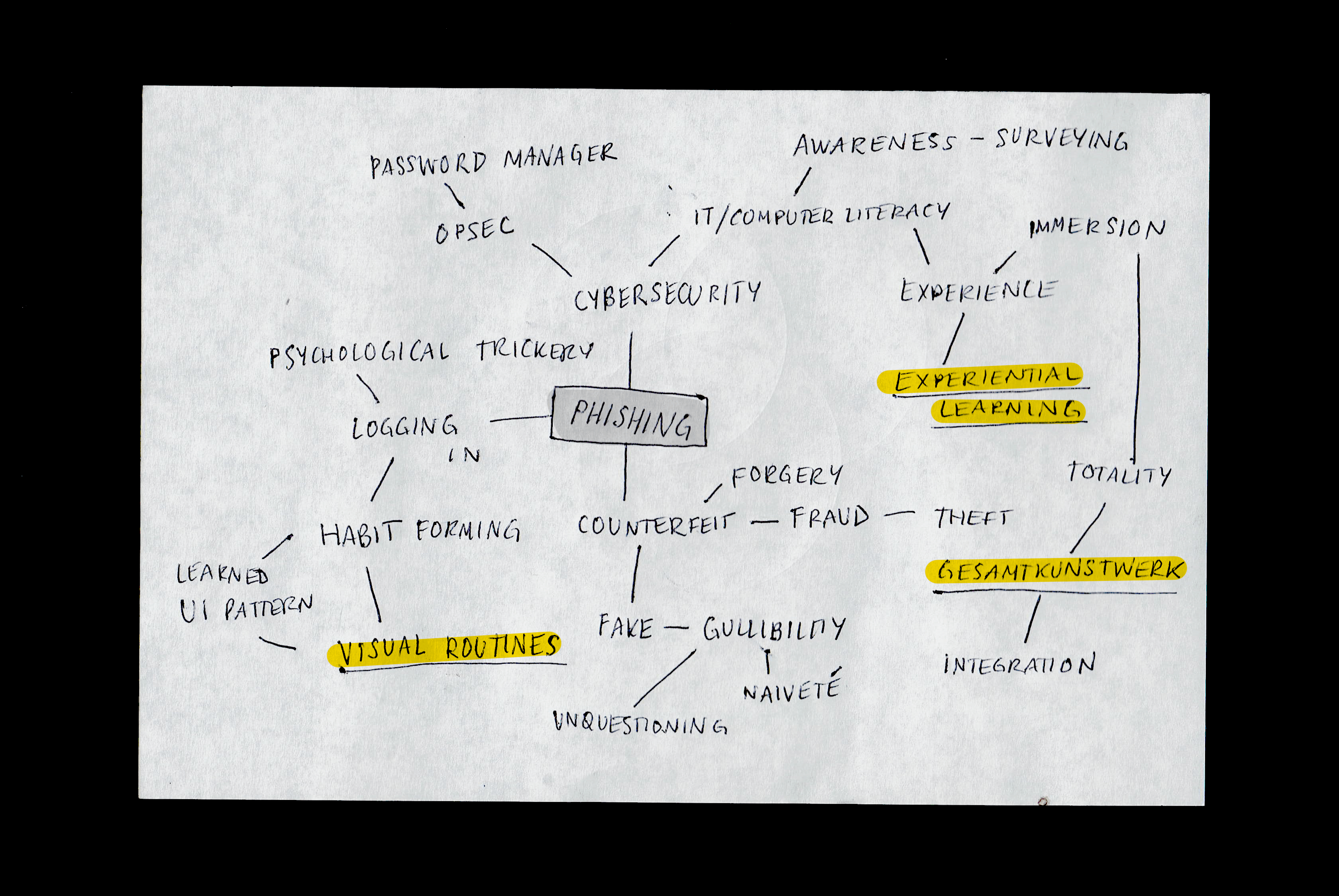
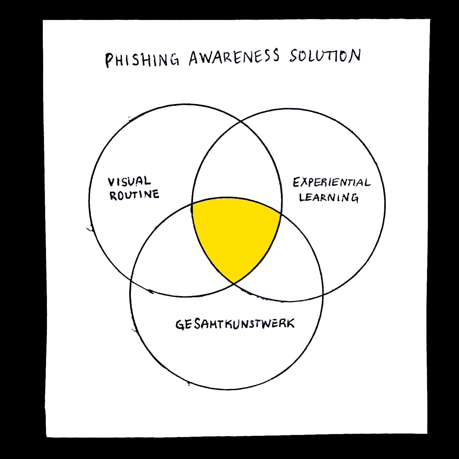
I decided to think about how people unlearn poor user behaviors. After a mind-mapping exercise, I came up with three main ideas between which my ideal solution would lie.
Visual Routines
As discovered, people are relying on previously learned habits to fall for phishing tricks. In order to be effective, my solution needs to reveal the presence of these routines and allow people to notice them in the future.
Experiential Learning
People grasp new technologies through experience. In order to be effective, my solution must be a piece that can be interacted with: something that either is or resembles a phishing website.
Gesamtkunstwerk
The experiential quality of the solution will be successful because of the totality of the experience, or gesamtkunstwerk. The students will log in to the same login page they use every day, but instead of being taken to the home page, they will be taken to a page that creates a meta-commentary on their naiveté.
With these parameters in mind, I set out to create what I think is an engaging experiment: a phishing site that targets students from the Maryland Institute College of Art and displays the number of passwords caught since launch once the user logs in. The site will consist of a login page and the previously mentioned meta page. The user will be redirected to the page after they enter their password and press enter, as per this user flow diagram:
Prototyping Phishing Site Layout
Brandjacking
I decided to use MICA’s branding designed by Pentagram as the visual language, identity and style guide for the alternate landing page. Like many style guidelines, it was available publicly and marketed as the MICA Communication Toolkit. I created a logo in the style of MICA’s sub-brands to follow the common phishing practice of brandjacking.
Although there is a plethora of colors to choose from, I picked the top three colors seen on MICA’s front page, since this is something that has already been prioritized before me by the original creators of the site.
Wireframing the Displays
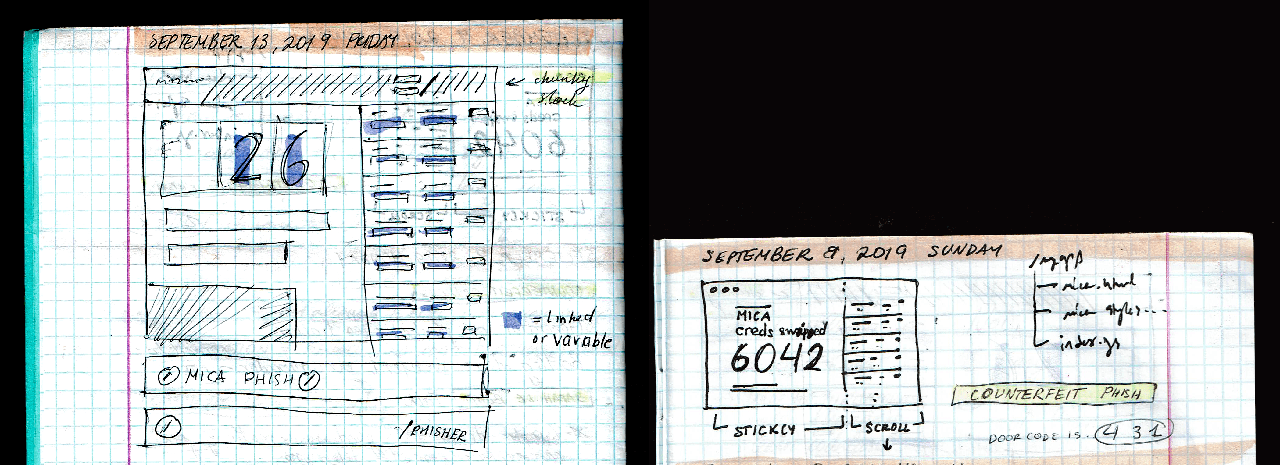
I started sketching out the pass-word display screen. The following information needed to be displayed:
- the number of credentials caught
- a running list of 10-15 credentials
- the Phisher logotype
- a disclaimer
Validating the Design with Students
Presenting the Phishing Site
To assess the effectiveness of my idea before setting up the exhibition, I presented the site to a series of Maryland Institute College of Art seniors. The following is a compilation of comments I have received that could improve the design:
Excessively Subtle Warning
- I would have put my real password in.
- I did not read the top at all.
Future for the Concept
An idea I had during the brainstorming phase was brought up during the critique: a phishing website generator. The concept is simple, a website URL will be processed and a clone will be created locally, containing the same markup, stylesheets and scripts. However, the password and login fields would be compromised and lead to an external site that will record the input and display it to the administrator. Although wanted by my classmates, the concept was a little bit too evil and legally gray for me to pursue.